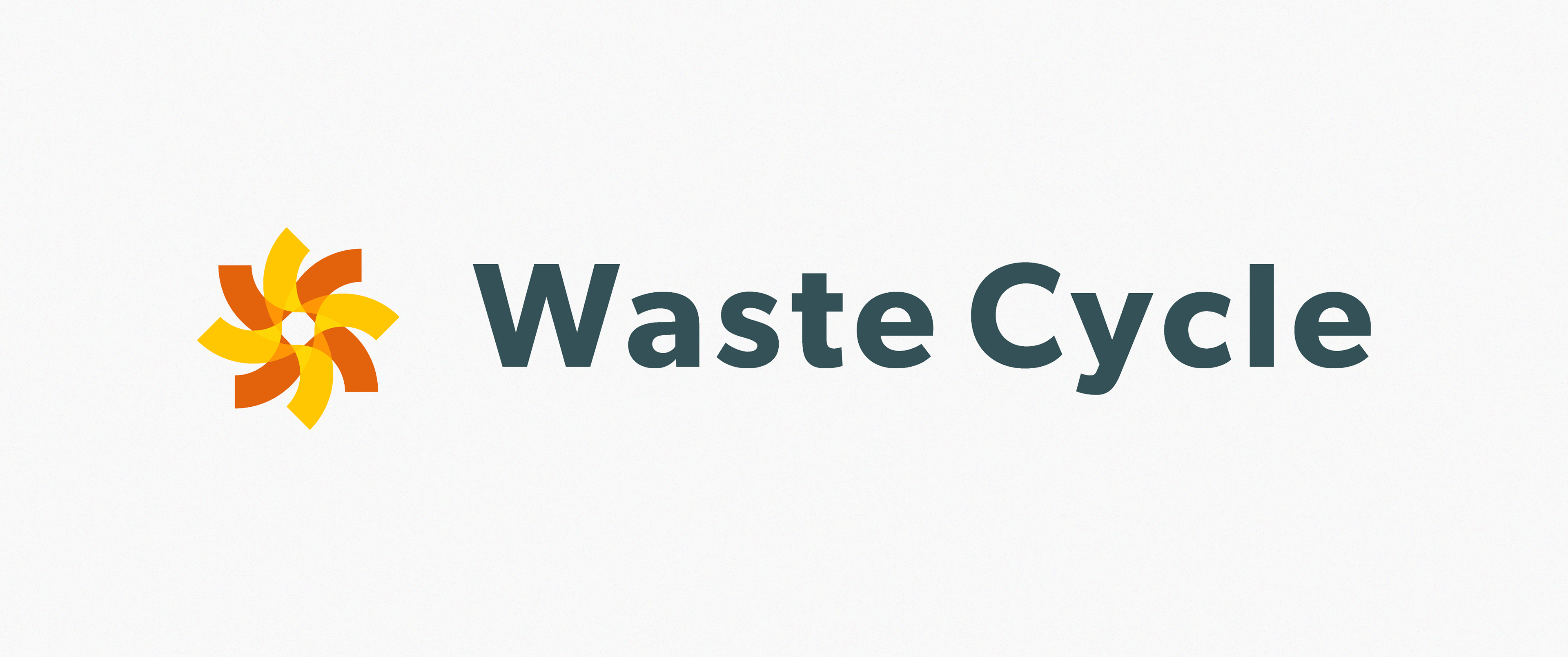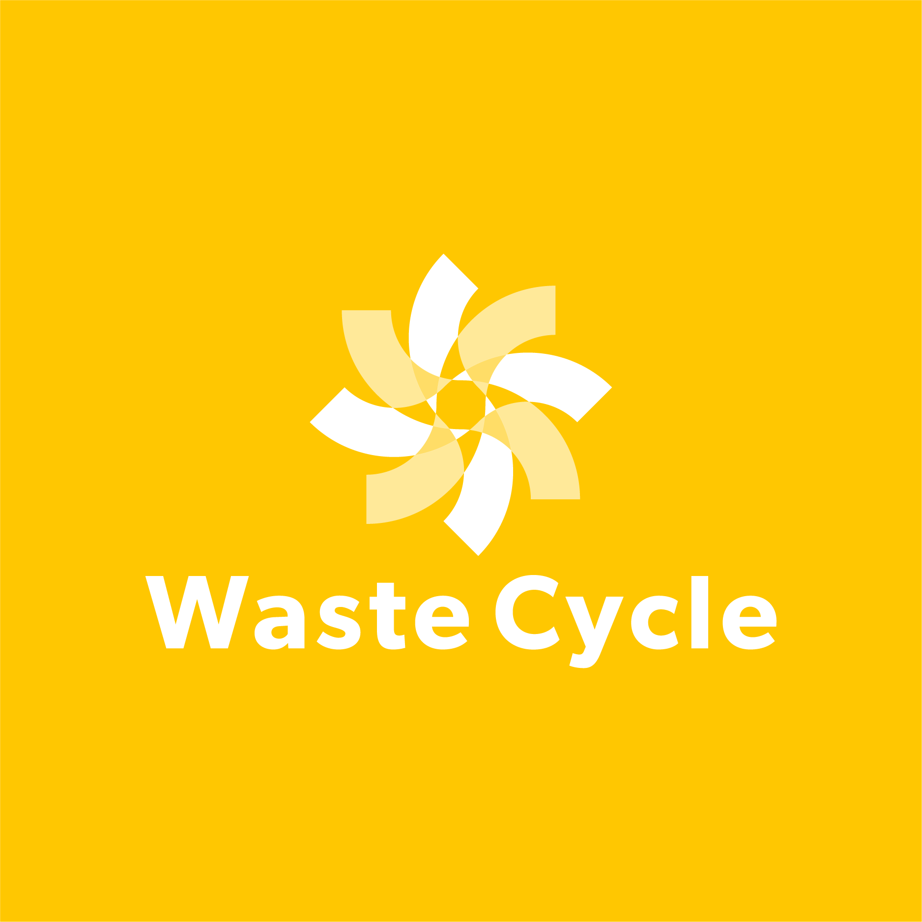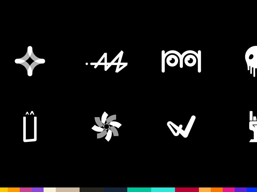


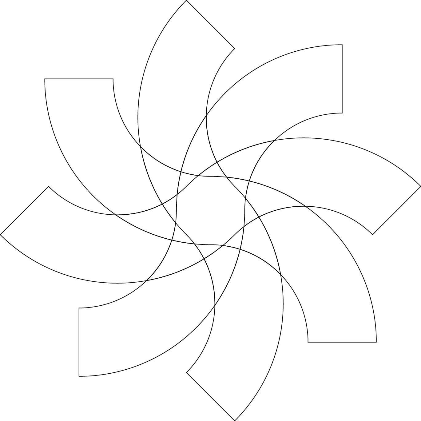
A ESTRUTURA DO SÍMBOLO
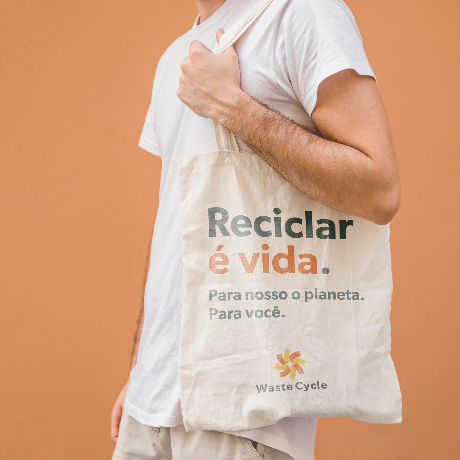
Waste Cycle represents a collective, inspiring and conscious movement about what we are doing with our waste. The intention is to reach the current generation made up of people who understand the new world as part of their daily lives and believe in the power of small actions. There is a solution capable of transcending the virtual with a compost kit that arrives at your home and an app that brings highly relevant content about how we can become protagonists in these small actions.
A Waste Cycle representa um movimento coletivo, inspirador e consciente sobre o que estamos fazendo com o nosso lixo. A intenção é atingir a geração atual composta por pessoas que entendem o novo mundo como parte do seu dia-a-dia e acredita no poder das pequenas ações. Existe uma solução capaz de transcender o virtual com um kit de compostagem que chega ao seu lar e um app que traz conteúdos altamente relevantes sobre como podemos nos tornar protagonistas destas pequenas ações.
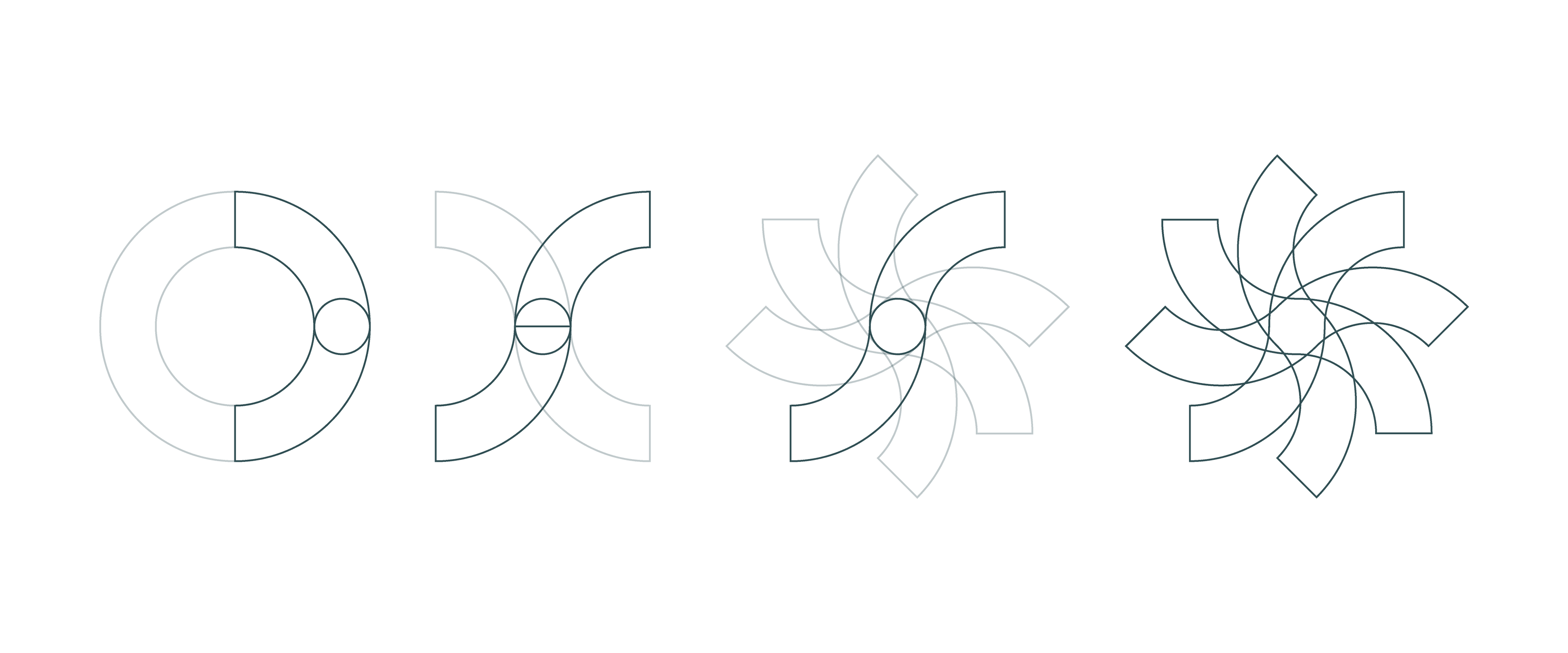
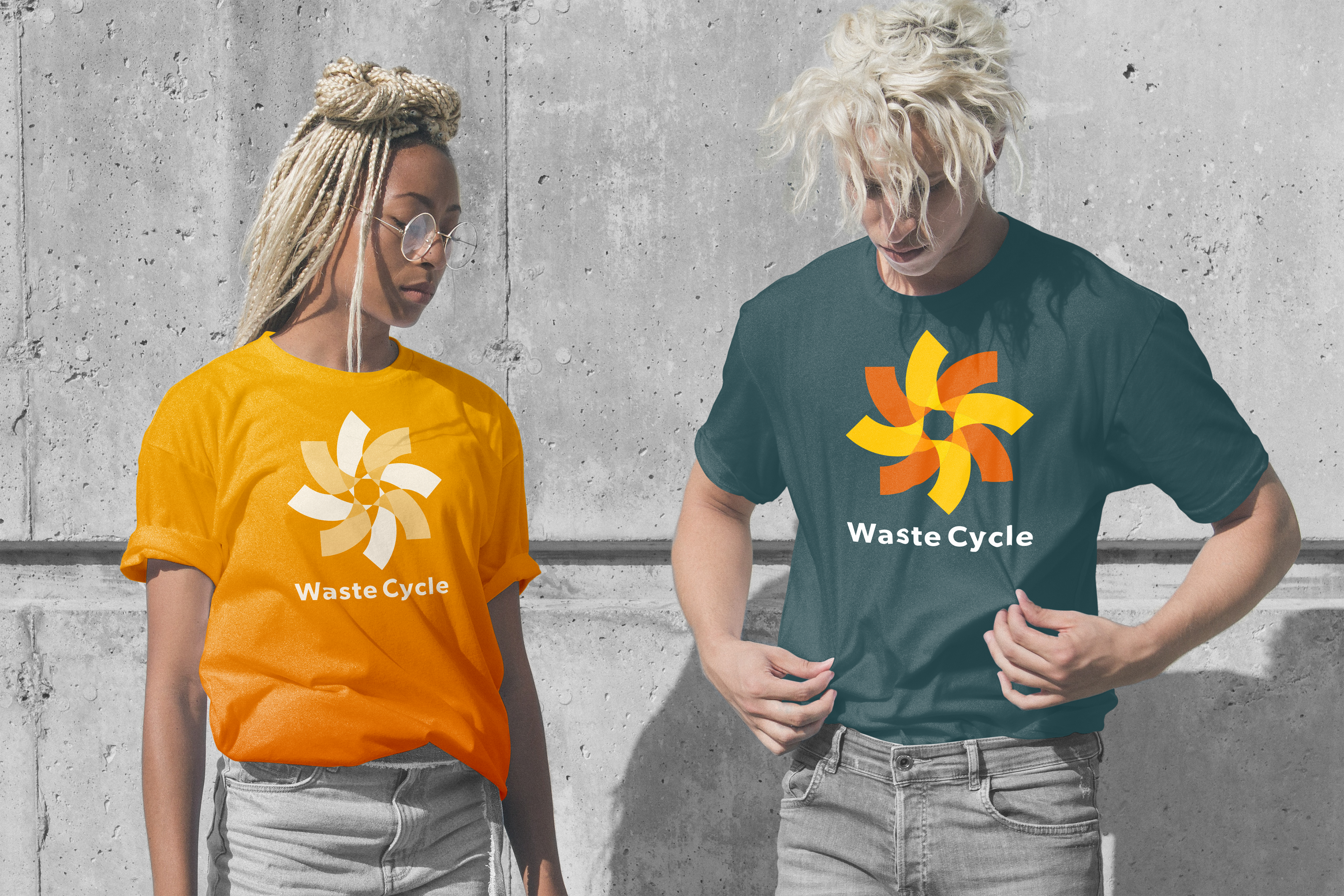
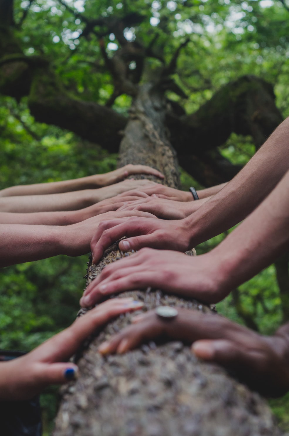
Considering the whole context, the symbol represents the union of two pillars of our movement. We are talking about Cycle (like each propeller of a weathervane that we can observe while the wind leaves its continuous iterations) and the Collective Work, many arms capable of giving strength to this great cycle of disposal and reuse of residues from our homes.
Considerando todo o contexto, o símbolo representa a união dois pilares do nosso movimento. Estamos falando de Ciclo (como cada hélice de um cata-vento que podemos observar enquanto o vento sobra suas iterações continuas) e o Trabalho coletivo muitos braços capazes de dar força a esse grande ciclo de descarte e reaproveitamento de resíduos dos nossos lares.


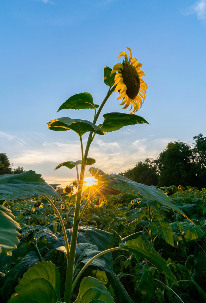
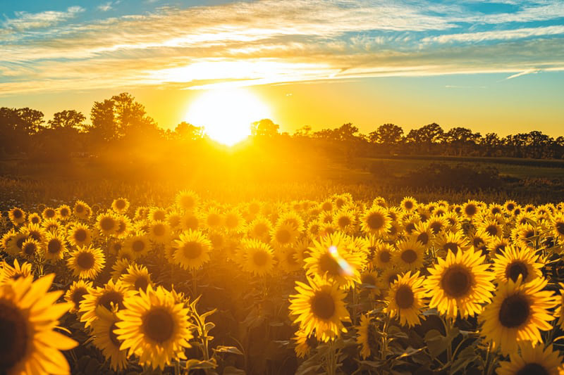
PHOTOSYNTHESIS COLOR
PALETA DE CORES "FOTOSSÍNTESE)
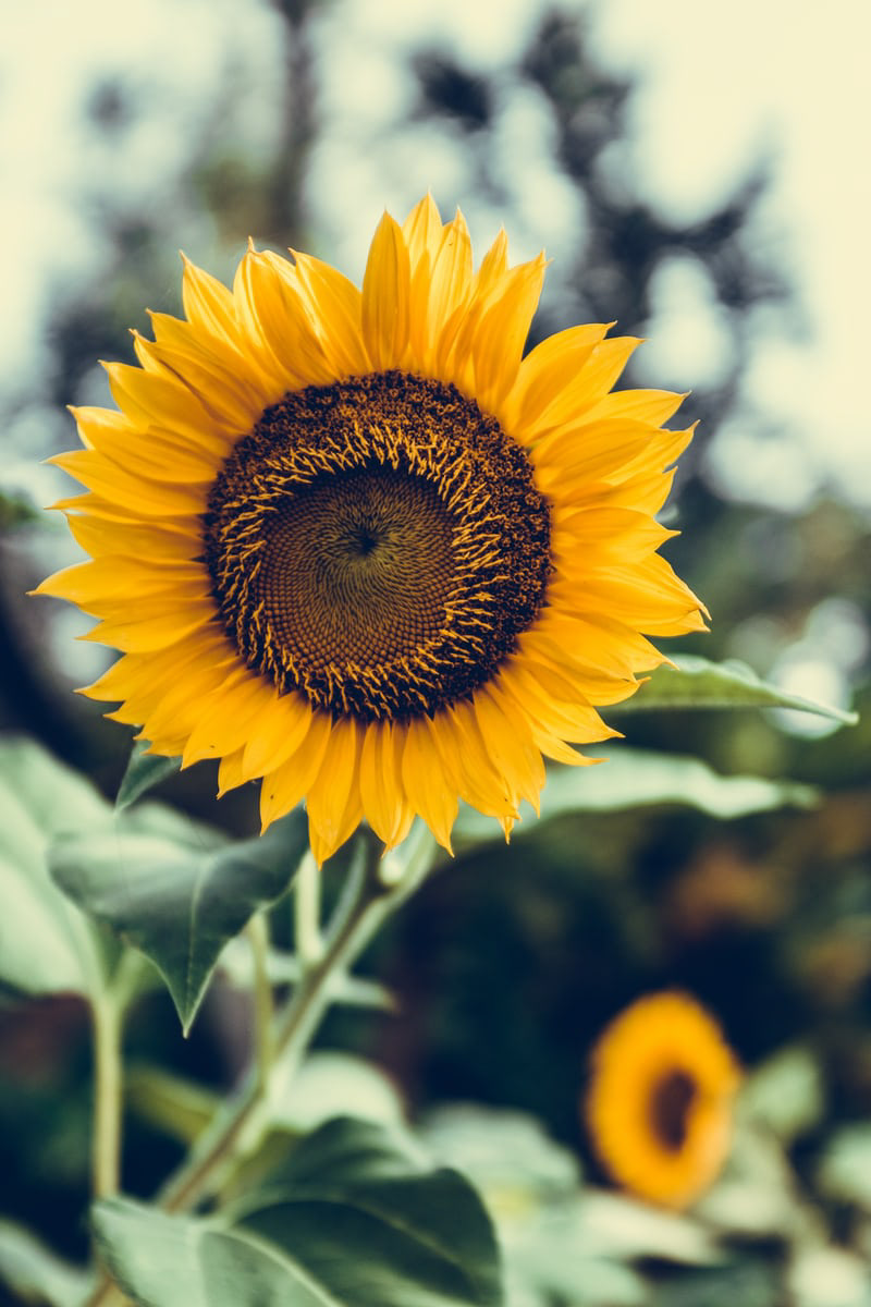
The "Photosynthesis" color palette was created from the colors and contrasts of nature, its primary colors refer to the heat of the sunflower petals while its neutral colors present the stems of flowers and plants. Why flowers? This brand is about all that, reaping beautiful results when we reuse our waste in the right way. Treat your worst side, your worst flaws, and turn them into good things.
A paleta de cores "Fotossíntese" foi criada a partir das cores e contrastes da natureza, suas cores primárias remetem ao calor das pétalas dos girassóis enquanto suas cores neutras presentam o caule das flores e plantas. Por que flores? Essa marca é sobre tudo isso, colher belos frutos quando reutilizamos nossos resíduos da maneira correta. Trate o seu pior lado, seus piores defeitos e os converta em bons frutos.